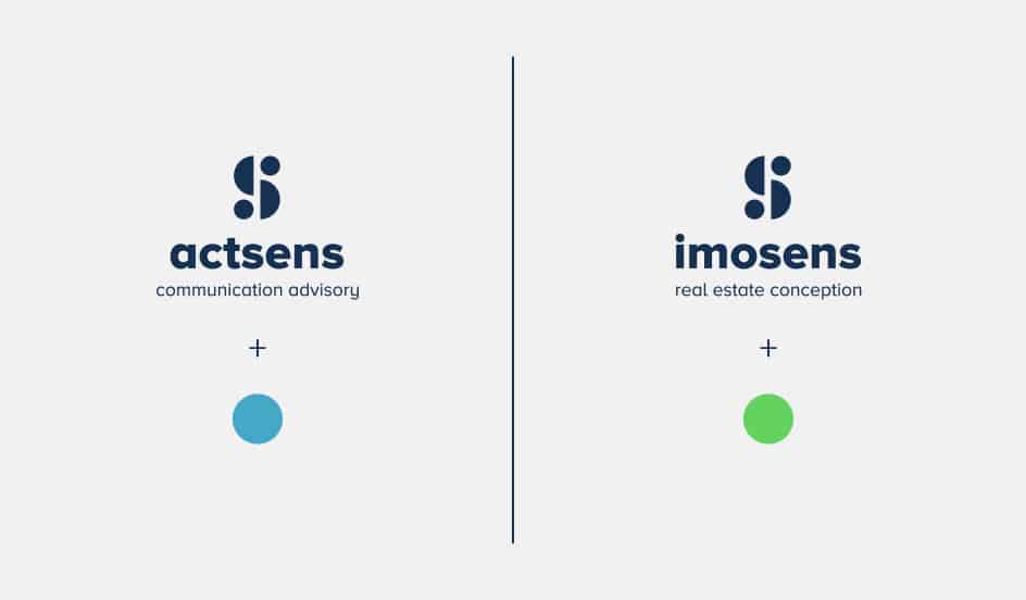
actsens and imosens are two entities belonging to the same group. We therefore focused our approach on the visual identification of this affiliation.
The corporate identities of the two companies were created from the common point between the two structures: the syllable “sens” and the letter “s”.
The logo’s pictogram is built on the idea of duality, using geometric shapes (the circle).
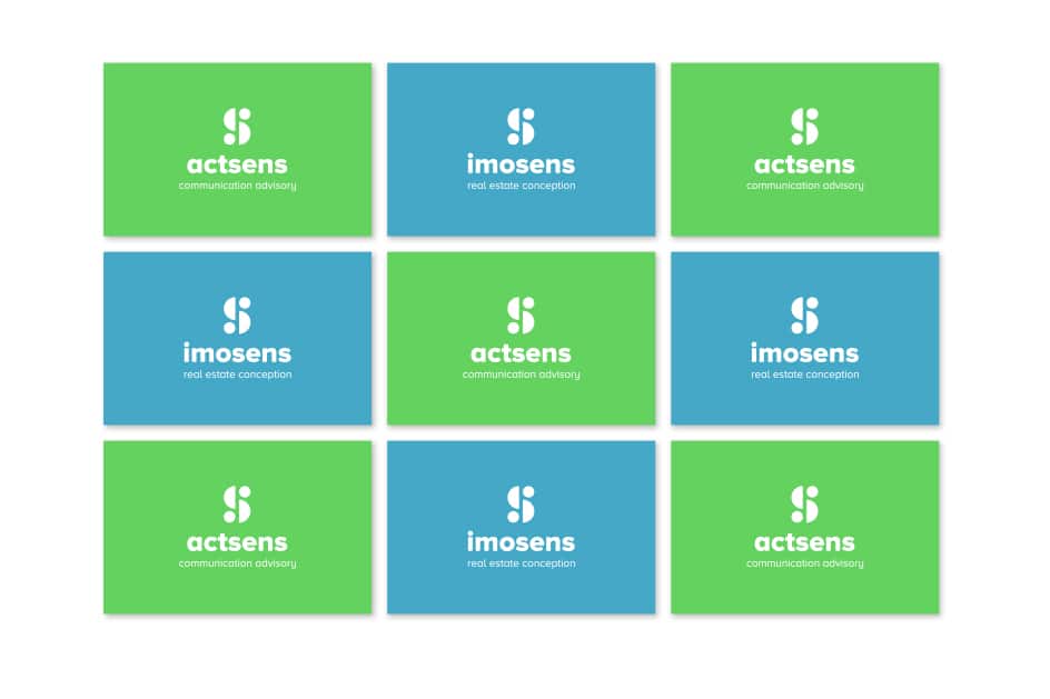
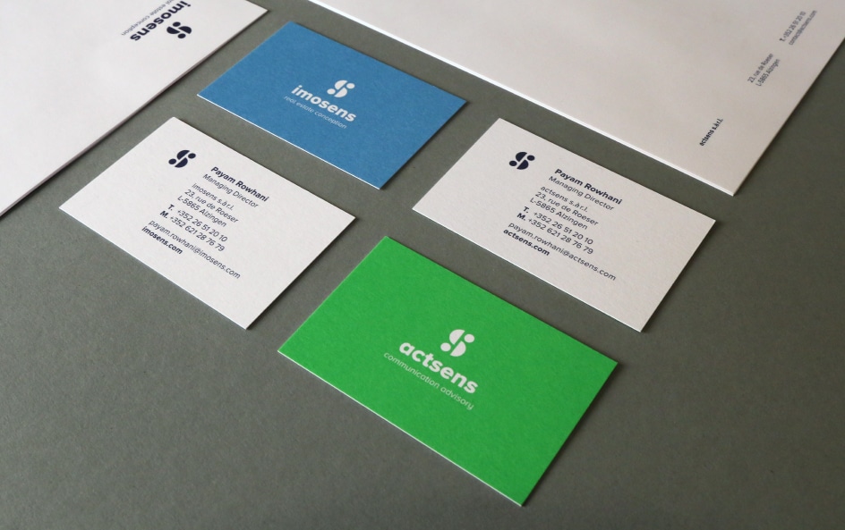
Each entity was assigned a colour: blue for actsens and green for imosens. The logo can thus be printed in negative on coloured media, such as business cards for example.
It nevertheless remains dark blue across all the stationery.