
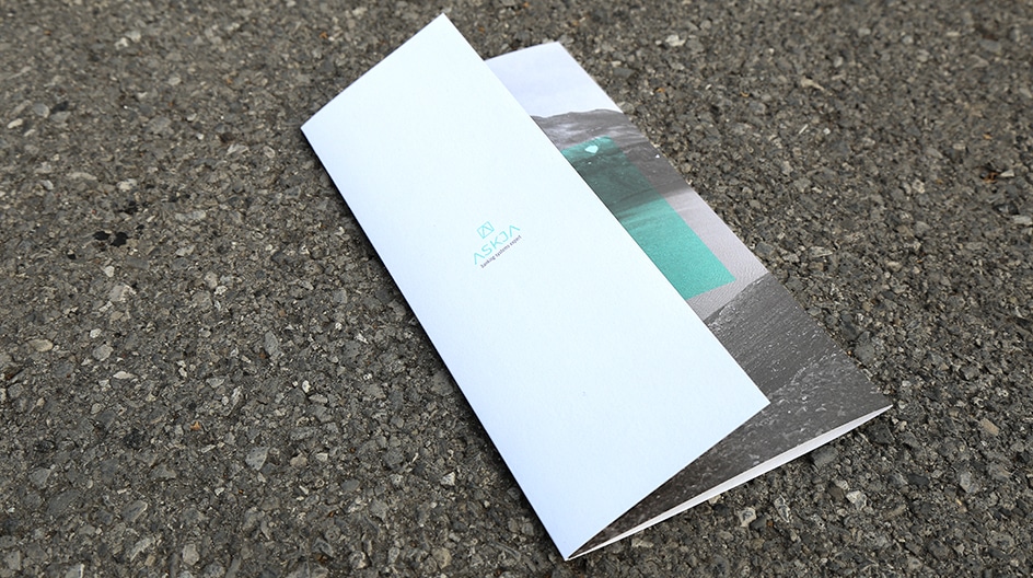

Askja is a company based in Luxembourg, specialized in projects to transform banks’ IT systems.
We first found the new name for this company following an in-depth study of the client’s business and of the values the company wished to convey.
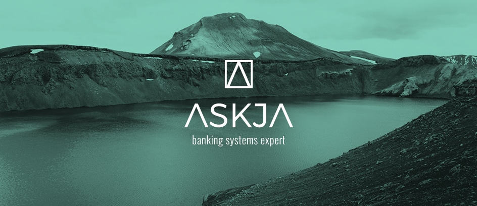
The word Askja, inspired by the Scandinavian world, is the name of a dormant Icelandic volcano.
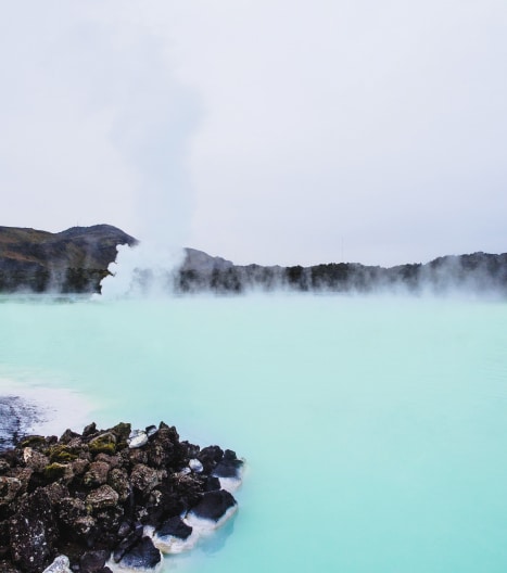
Its landscapes inspired the logo and the graphic universe of the company.
First, the colours: a luminous, milky blue that recalls Icelandic hot springs, and the slate grey of the rock typical of this geographical area.
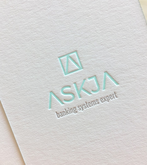
Then the symbol: the letter A, but also the mountain, the volcano, and the modernity that emerges from the distinctive spelling of the word Askja.
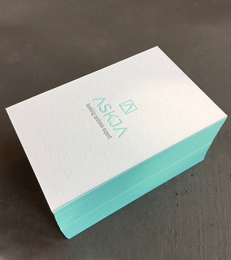
A photographic universe in keeping with the whole, as well as patterns, punctuate the client’s message across all its print media (business cards, leaflets) and on the website, which we wanted to be clean and clear.