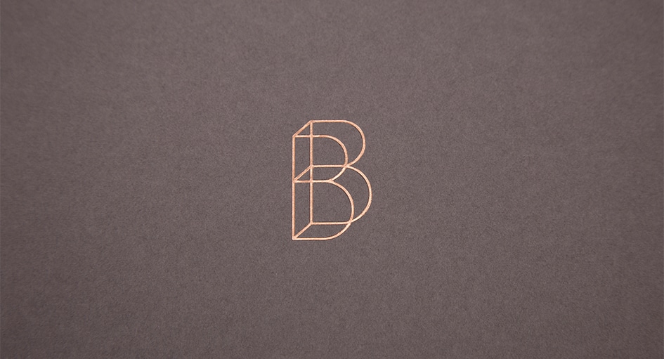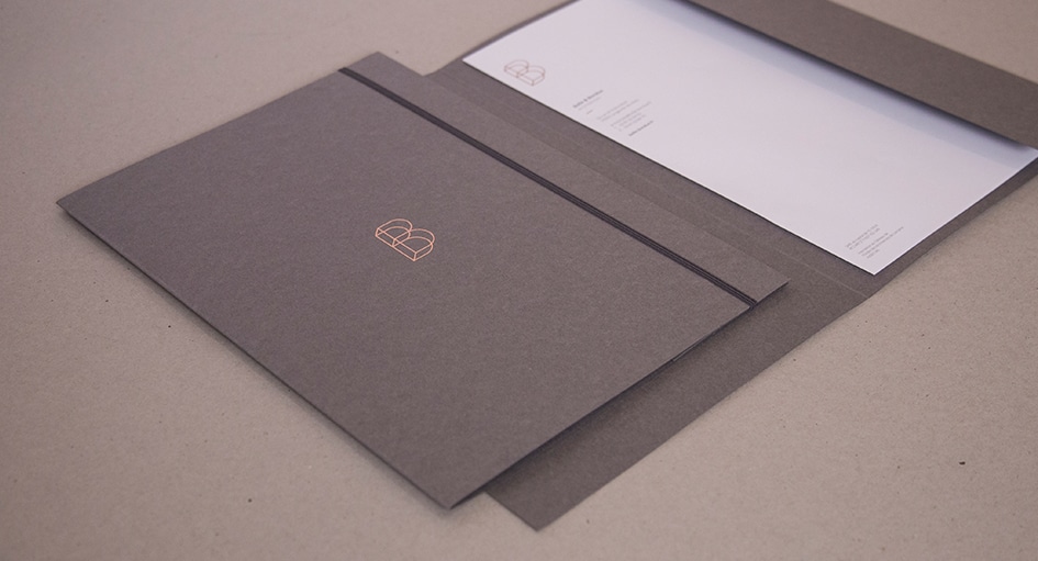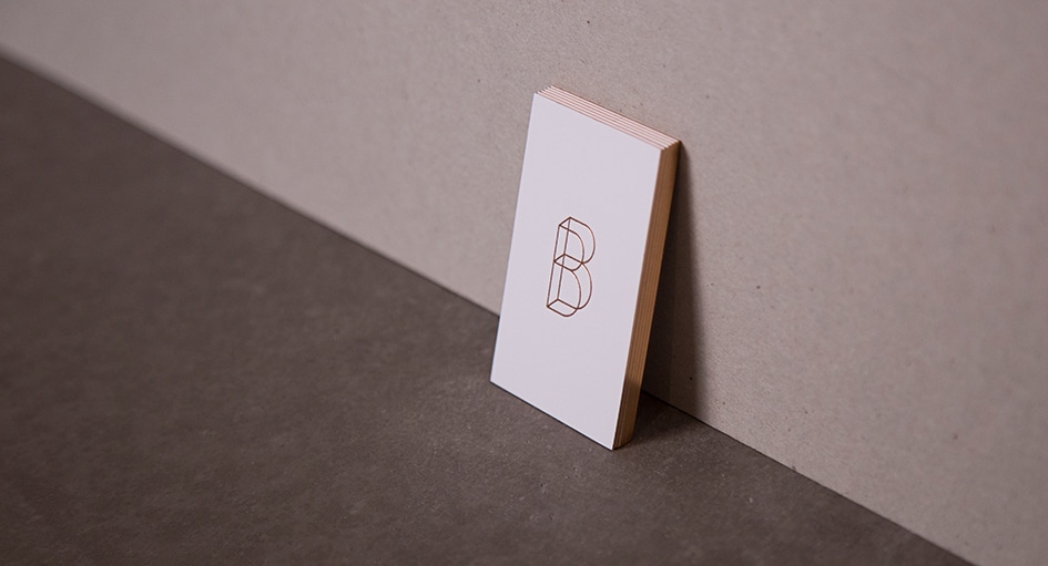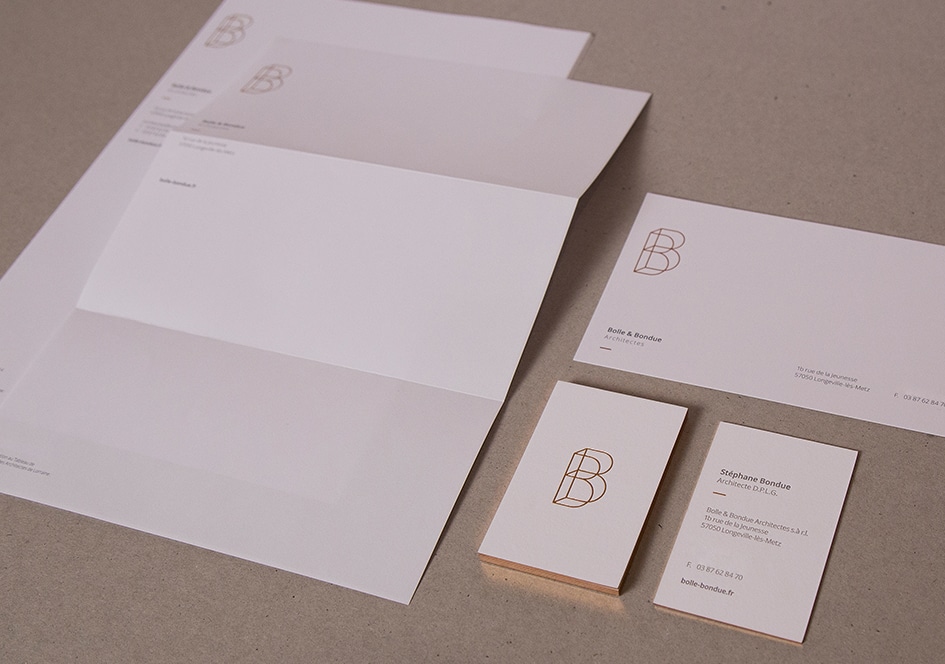
The new visual identity of Bolle et Bondue consists of two elements: a pictogram and a typeface announcing the name and activity of the firm.
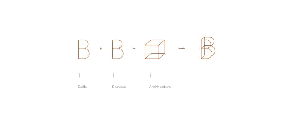
The pictogram is made up of the two B’s of Bolle et Bondue, given volume to recall their profession: architecture. Jean-Marie Bolle is a well-known figure in this field, thanks to his many projects for shops, institutions and private individuals alike. The contemporary lines of the logo recall his passion for harmony of forms, the nobility of materials and the constant pursuit of light. This logo is meant to be immediately recognizable and identifiable, much like the “Bolle” style for houses.
These two elements can be used together or separately, depending on the media.
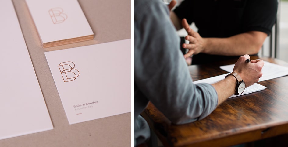
Copper hot foil stamping was used for the pictogram and the edge of the business cards, making this corporate identity more elegant and exclusive.
The mass-tinted paper gives substance and refers to the materials used in construction.