The CAA is the official supervisory body for the insurance sector in Luxembourg.
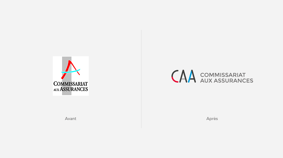
Rethinking a visual identity requires taking ownership of what already exists, and knowing its codes and its history. A new logo is indeed a decisive moment in the life of a company or institution, as it can signal a desire for renewal and dynamism as much as a genuine break.
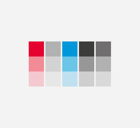
The CAA’s logotype carried strong values. Its pictogram took the graphic form of the letter A, while symbolizing the mechanism of the deposit agreement with its three bodies: the insurance commissariat, the custodian bank and the insurance company. Its colours, for their part, showed the establishment’s roots in the country.
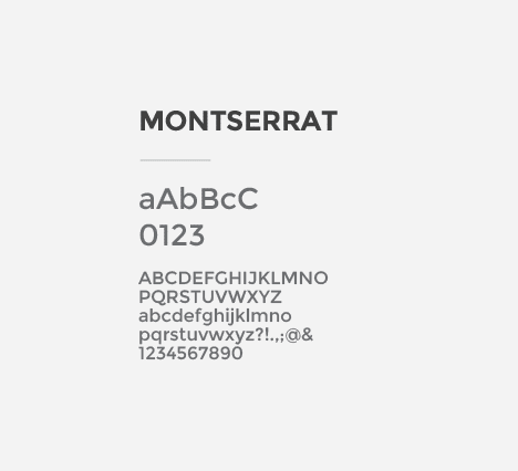
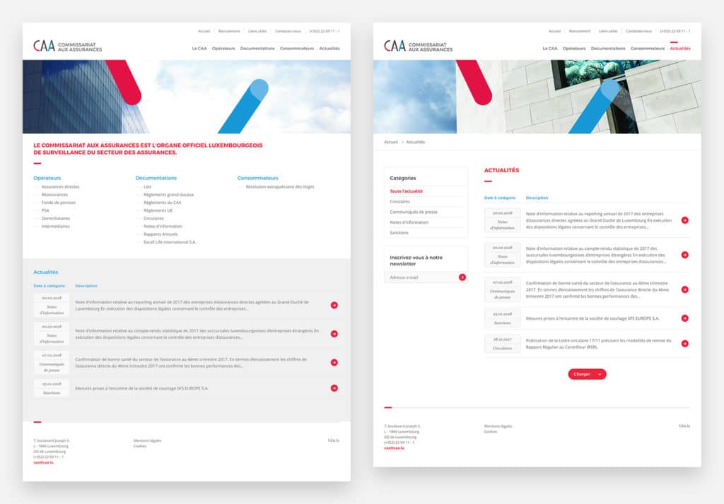
Building on these codes to create a new, more modern and dynamic visual identity was an obvious choice.
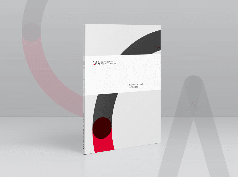
This graphic line was then applied to many media: stationery (business cards, letterheads, envelopes), templates for desktop publishing software, and so on.
The identification signage of the building was rethought with the installation of new plates and flags.
This project was carried out by h2a, communication agency in Luxembourg since 2004.