The visual identity of LA Immo is inspired by the human and professional values of its founder, Leyli Schaber.
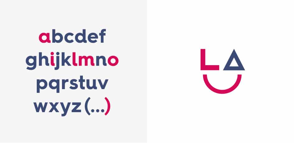
Trust and seriousness are represented by a colour: a deep, powerful blue. A bright pink, meanwhile, brings contrast and dynamism, along with a very positive value such as kindness. The notions of partnership and closeness are further asserted through the creation of the logotype and its pictogram. The letters L and A (standing for Leyli Agency) are thus the starting point for the elements that make up a smiley. The circle, symbolizing happy clients, forms the smile. As for the typography, a round and soft typeface was chosen: HurmeGeometric Sans.
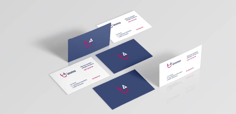
This coherent, high-end visual identity has been applied to the stationery and the website. Developed with the Symfony framework, the site offers content in four languages: French, English, German and Luxembourgish. A bridge has been created with the apimo tool to make publishing property listings easier.