Lëtzebuerger Guiden a Scouten (Guides and Scouts of Luxembourg) is the largest scouting federation in the Grand Duchy of Luxembourg.
At h2a, we are always ready… to take on challenges! When the Lëtzebuerger Guiden a Scouten contacted us to review their visual identity, we sharpened our pencils, took out our best notebooks and rolled up our sleeves to support the graphic transition of this centenarian Luxembourgish institution.
The challenge was to modernize their universe while respecting the existing codes. We therefore opted for an effective redesign, but one that keeps to historical continuity.
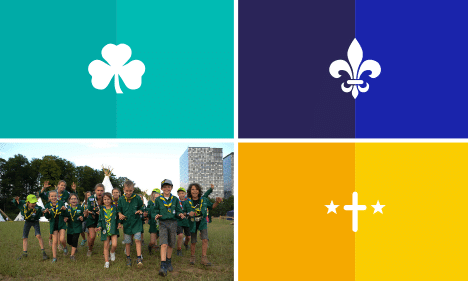
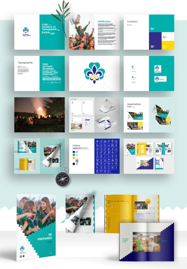
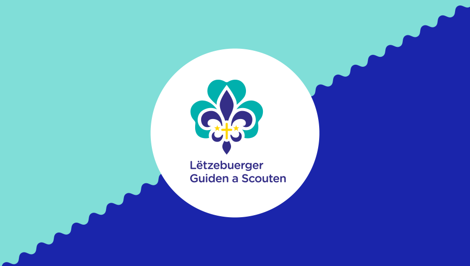
The logo is made up of several colours and several symbols: the clover, the fleur-de-lis, the two stars and the cross. Each of these elements has been reworked to look more modern, but above all they have been rebalanced for a better connection with one another. The colours and the typography have also been changed to feel more contemporary.
A whole distinctive graphic universe has also been set up to accompany this new corporate identity. For this we wanted to add a playful touch more in tune with the “scout” spirit: lively graphic shapes and pop colours dress the latest communication media, and in particular their magazine DE PLATTE KNUET, of which we produced the first issue.
Alongside this assignment, we were also commissioned to review the logos of all five scout branches: Biber, Wëllefcher, AvEx, CaraPio and RaRo. Each now has a new identity with its own colour, symbol and shape.
Before

After