Several years ago we worked on the Le Lavandier project. The real estate developer Allfin (now Immobel) and the architecture firm m3 architectes joined forces to create a new residential complex.
Its name, Le Lavandier, is inspired by the name of its street: rue Emile Lavandier. The 48-apartment residence is intended to have a quality architecture, in the spirit of the Belair district.
Modernity and quality are the two guiding principles of the Le Lavandier project. The whole residence was designed along these lines, and so was its visual identity. The two letters “L”, borrowed from the initials of the project, remain the starting point of the approach. These letters placed side by side, together with the current clean typeface, emphasize the architecture of the residence.
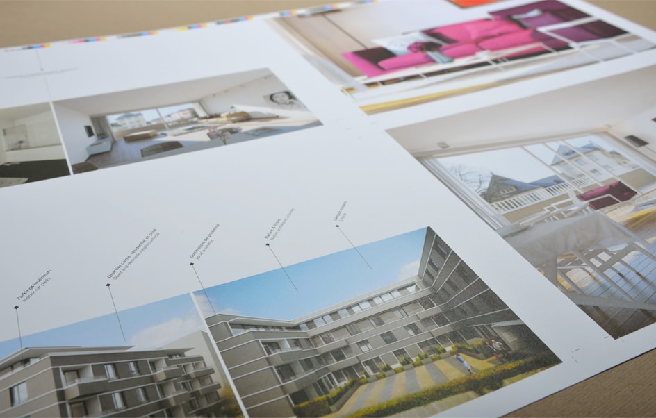
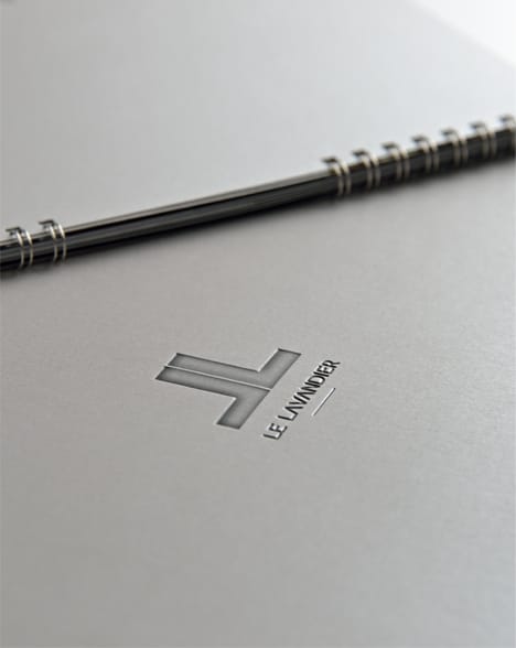
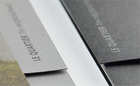
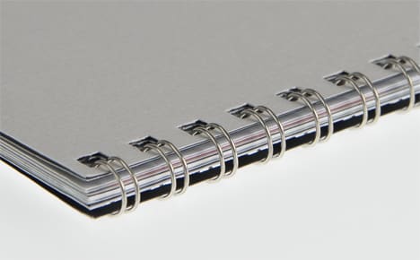
The brochure, conceived with the same intention, presents the real estate project in its entirety. Sober and modern, it gives pride of place to the visuals while revealing the key information about Le Lavandier. The system of dividers makes it easy to read. The dominant tones, black, white and various shades of grey, recall the “metal” and the “raw” appearance of the materials used on the building’s facade. This choice also influenced the choice of paper: Gmund 925, with its “brushed metal” appearance, and a spiral binding to accentuate the effect.
The identity of the project appears on all the materials (produced by h2a) supplied to the real estate developer Allfin. The sheets dedicated to each apartment take up the colour codes and simplicity found in the brochure, as does the construction hoarding, which in the same way fits the spirit of the residence.
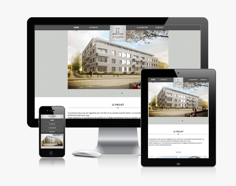
The design of the website reflects the residence: simple and modern. It presents Le Lavandier in its entirety. Its responsive design offers visitors optimal navigation. Whatever the size and resolution of the screen, no information is lost. Its particularity, however, lies in its navigation: all the content is organized on a single page. Practical and easy to use, this operation is made possible by a navigation bar that is always present.