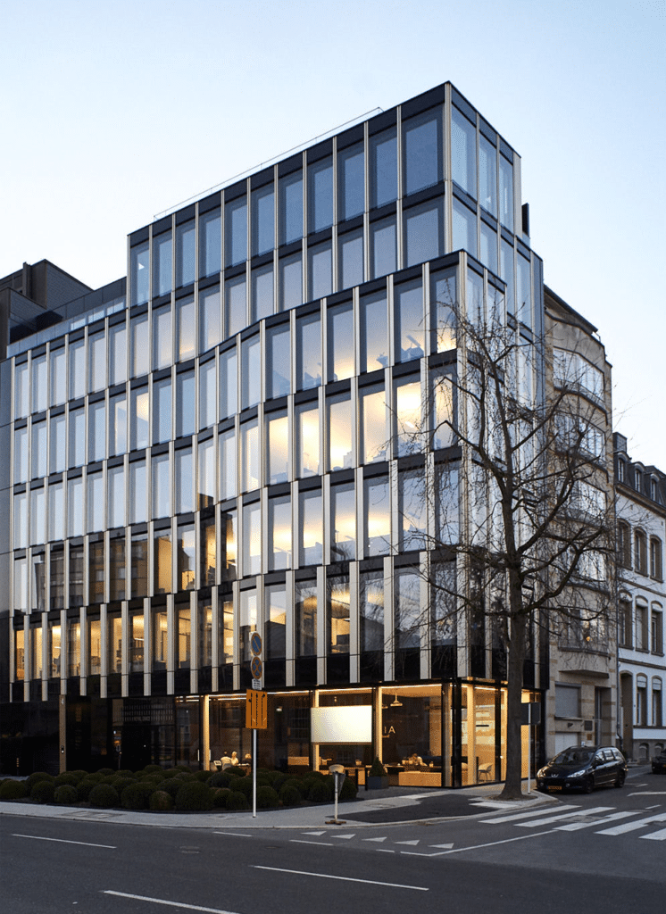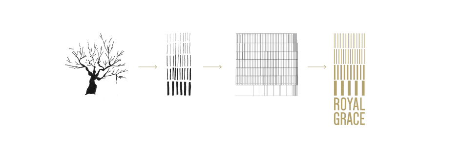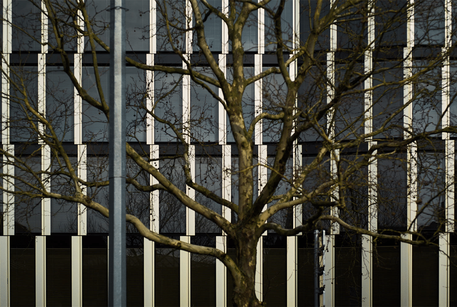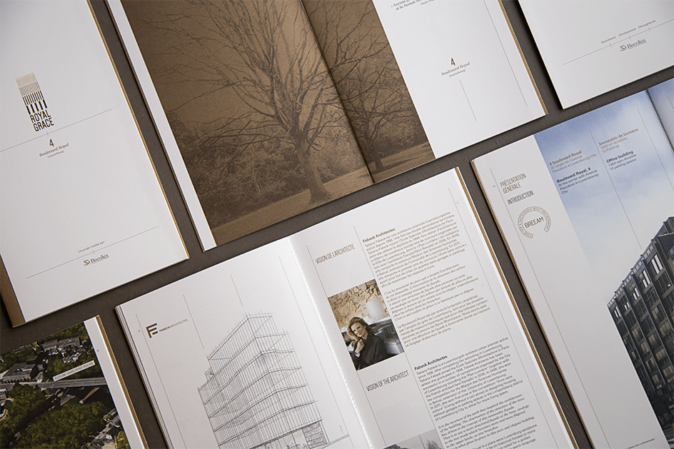
Starting point: the branching of the tree as the architectural concept of this office building, located on the prestigious Boulevard Royal.
For our graphic studio, three possible interpretations:
– Typographic weights
– Colour intensities
– The thicknesses of the signage supports
Creating the logo in the form of a crown then became an obvious choice to honour this royal building.
The keywords that guided our work:
– Verticality
– Tree and branches
– Simple
– Modern
– Majestic
– Gold and black
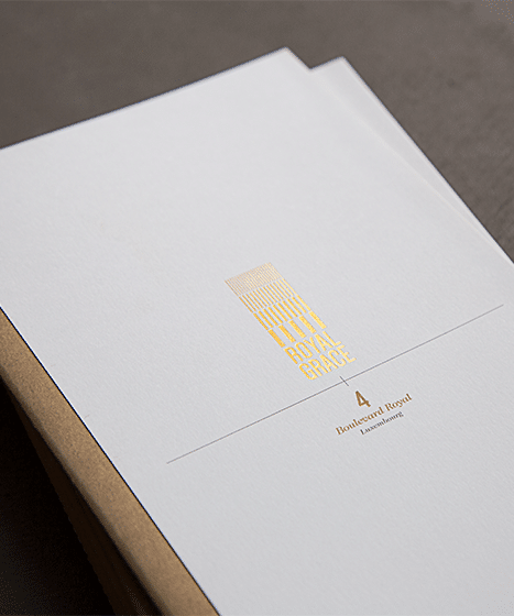
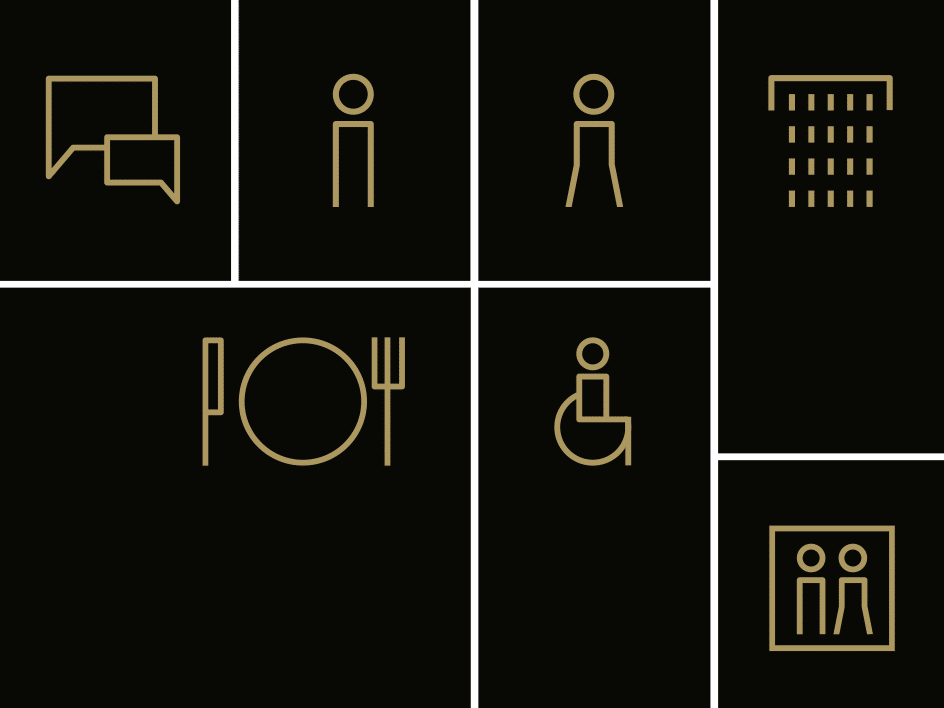
In addition to the marketing brochures and the website, we developed the entire signage concept for the building.
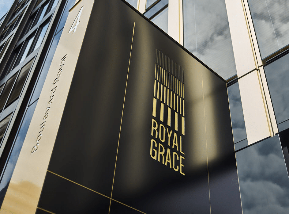
We produced a majestic outdoor totem, 4 metres high. The building’s logo was milled into black sheet metal and, in the evening, lets through a golden light.
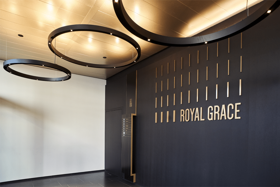
A monumental mural adorns the entrance hall. Here the logo was deliberately deconstructed so that it could decorate the entire main wall.
The interior totem is in itself a true work of art. It was shaped to echo the architectural concept of the tree.
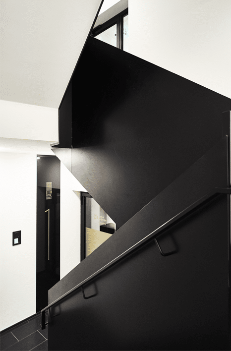
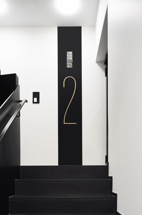
The signage of each floor was designed to dress each landing in all its verticality.
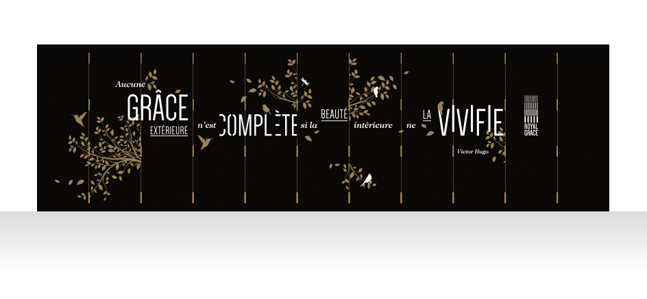
Finally, the garage entrance wall also received a monumental graphic treatment, with more than 14 m² of stretched fabric.