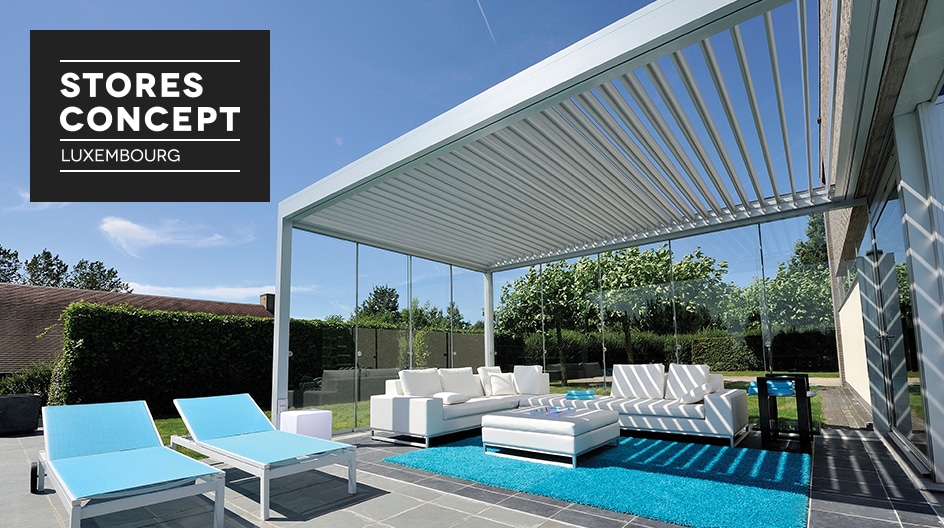
Recently established in Luxembourg, this brand offers a space entirely dedicated to the world of blinds. With 20 years of experience, it offers a range of interior as well as exterior blinds.
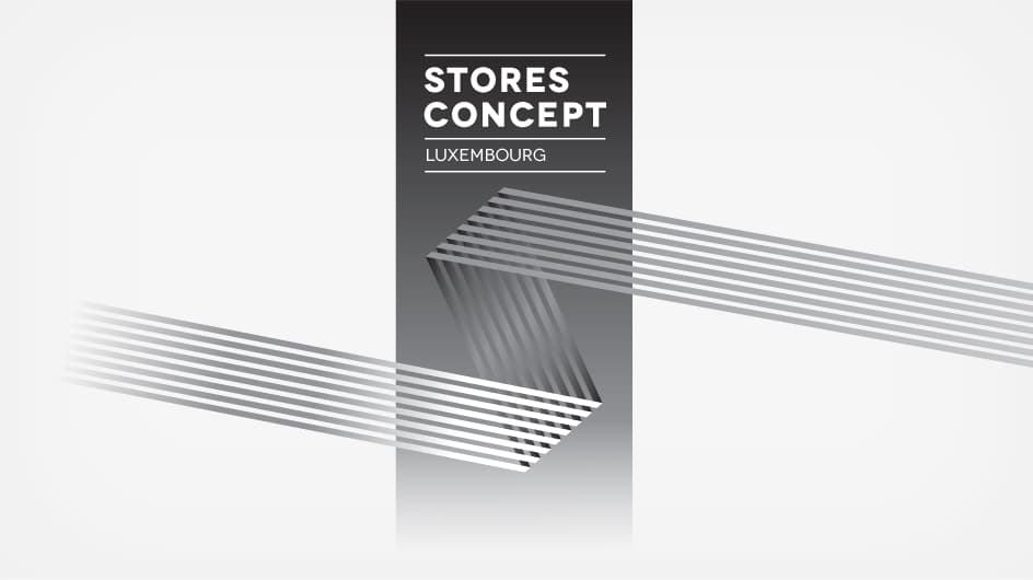
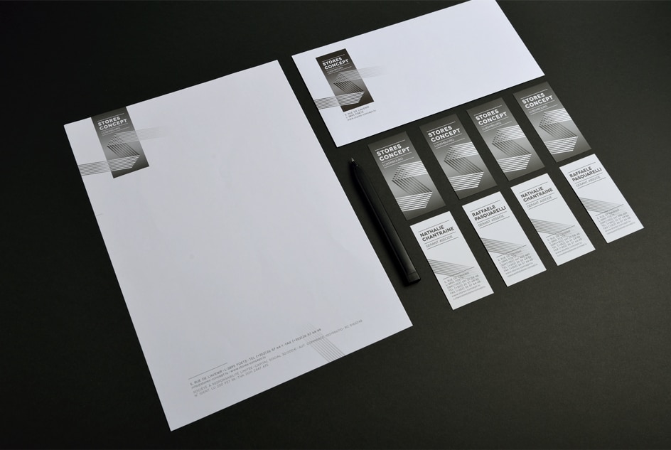
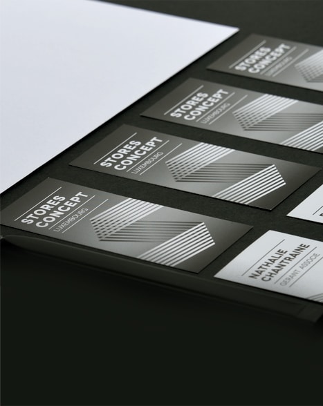
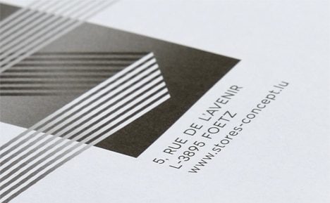
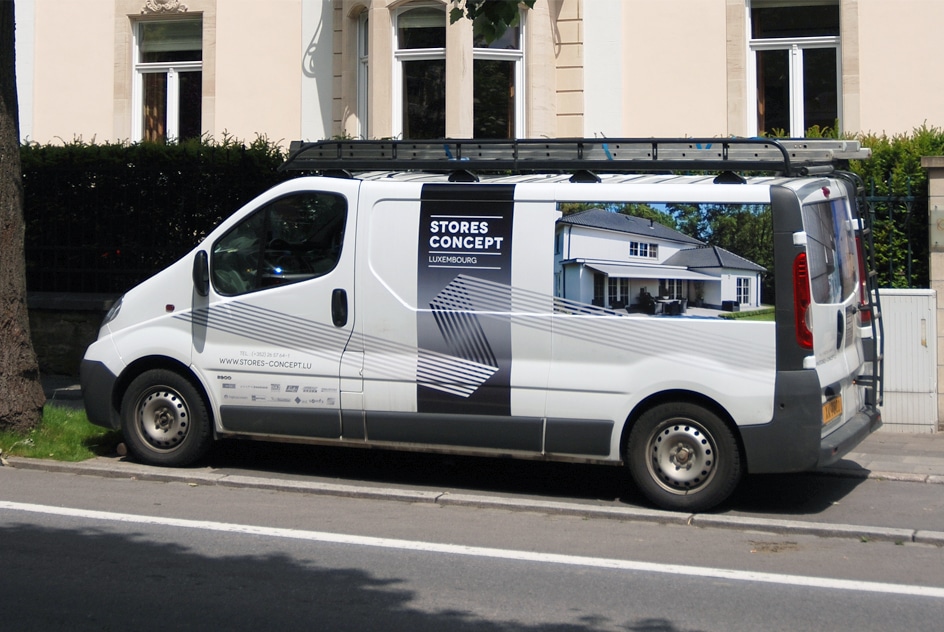
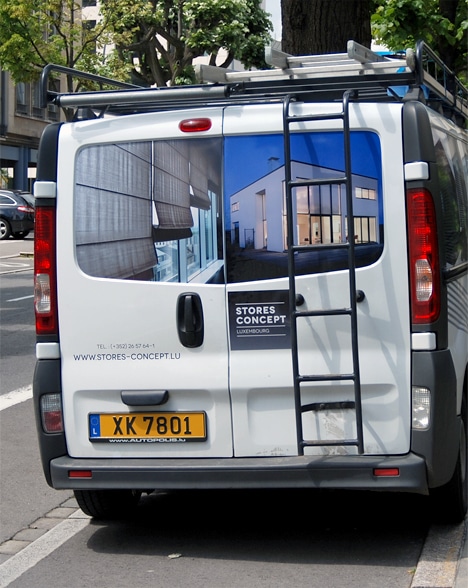
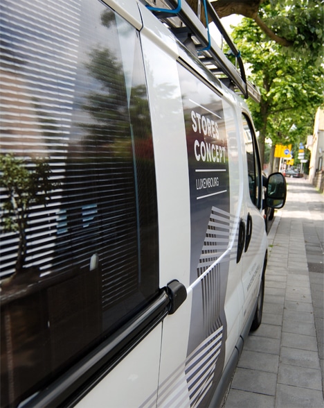
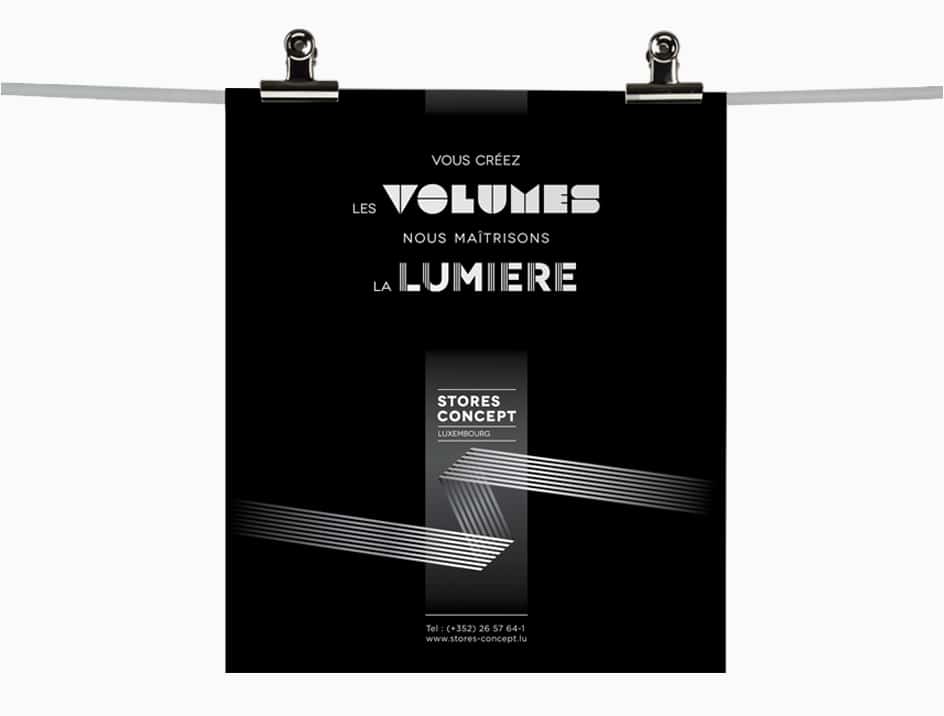
A blind either blocks out the light or lets it into a room. In both cases, it is a skilful mix, a play of shadow and light specific to the function of the blind. The logo therefore had to reflect this duality. A compositional work was carried out on the lines to imitate blind slats, in the form of the letter “S”, the initial of the brand. The rounded typeface softens the rigidity of materials. The contrasting colours (black and white) reinforce the overall idea. Applied across all media, this “symbol” illustrates the brand’s know-how and its mastery of light.