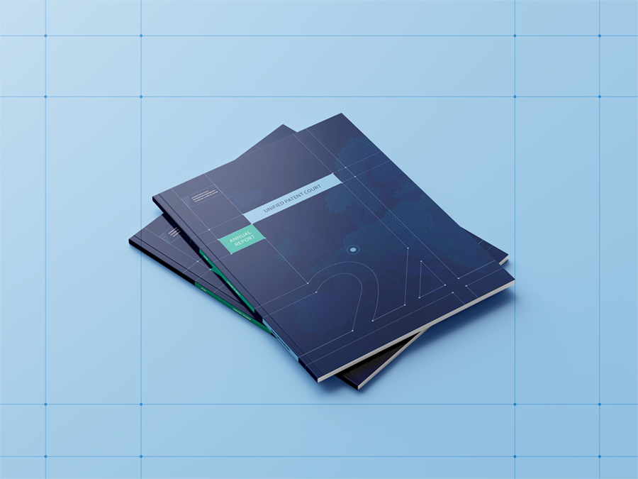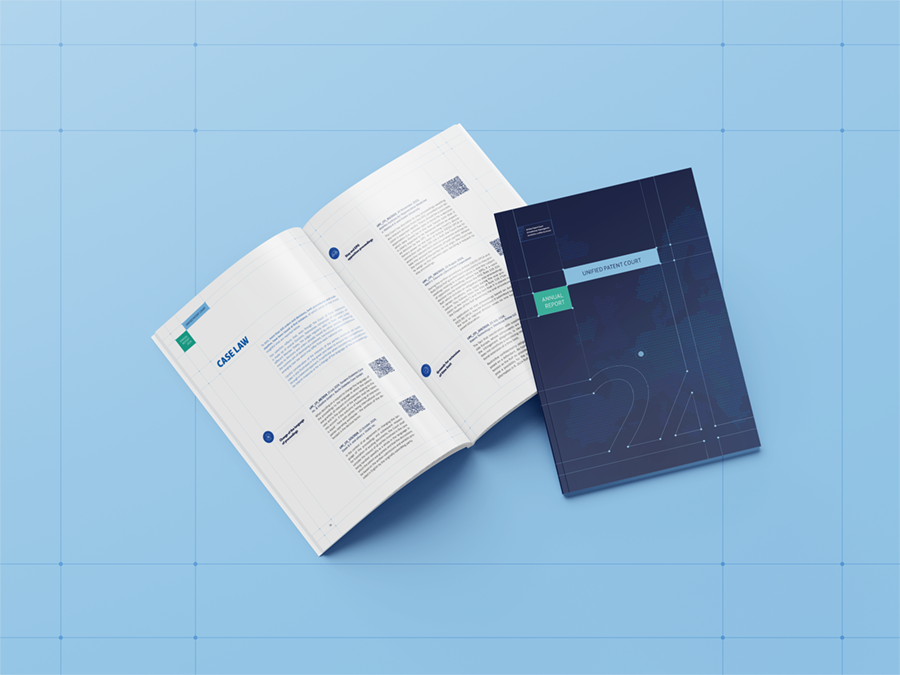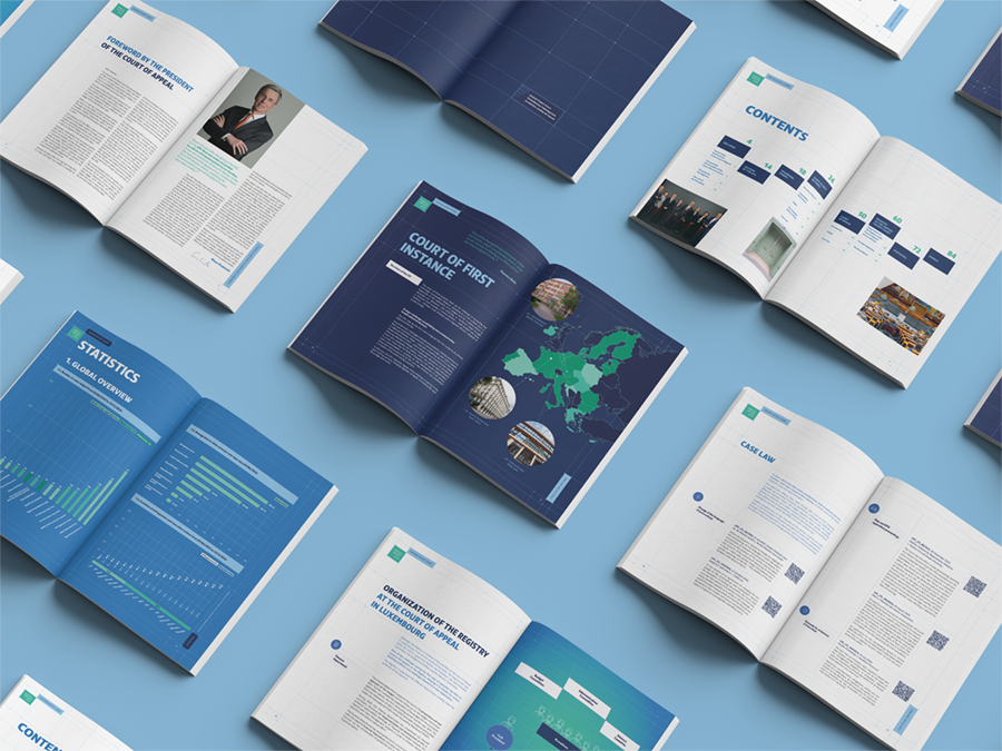
For its very first annual report, the Court of Appeal of Luxembourg trusted our agency to design a document worthy of its institutional role. An exciting project that immersed us in the heart of this institution’s history, from its creation to its inauguration.
More than a simple report: a genuinely creative approach
Our ambition was to create a document that goes beyond simply presenting figures. We designed a unique communication object, both informative and aesthetic, which tells the story of the Court and highlights its commitment to a European framework for patent protection.
A bespoke visual identity, inspired by the Court’s logo
Our creative team drew inspiration from the Court’s logo to create a strong, coherent design. The structured, rectilinear layout grid recalls the rigor and precision of legal work. The intersection points of the logo, meanwhile, symbolize the European network with the various legal bodies present in the Member States.
A design that humanizes the institution and highlights its role
We also wanted to create a design that puts the people behind the institution in the spotlight. These same connection points of the logo symbolize the people who contribute to the development of the Court.
Finally, the iconographic palette, colors and typefaces were carefully chosen to reflect the official status of the Court while bringing a touch of modernity. The choice of two distinct paper tints for the general and statistical sections underlines the importance of each part of the report.