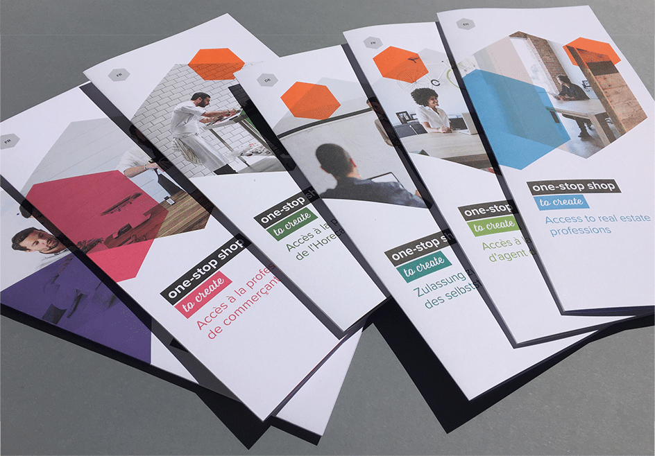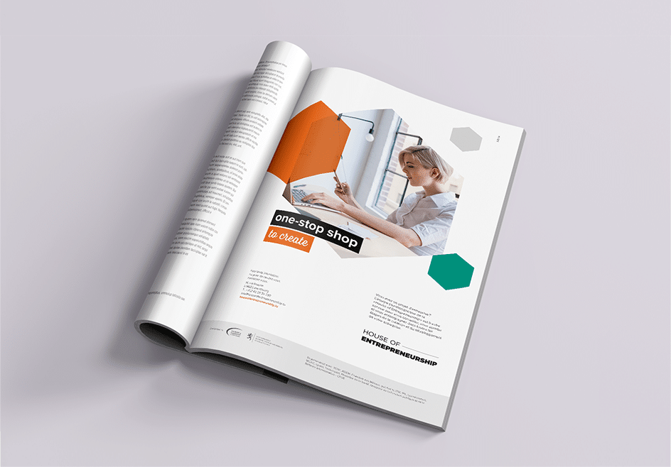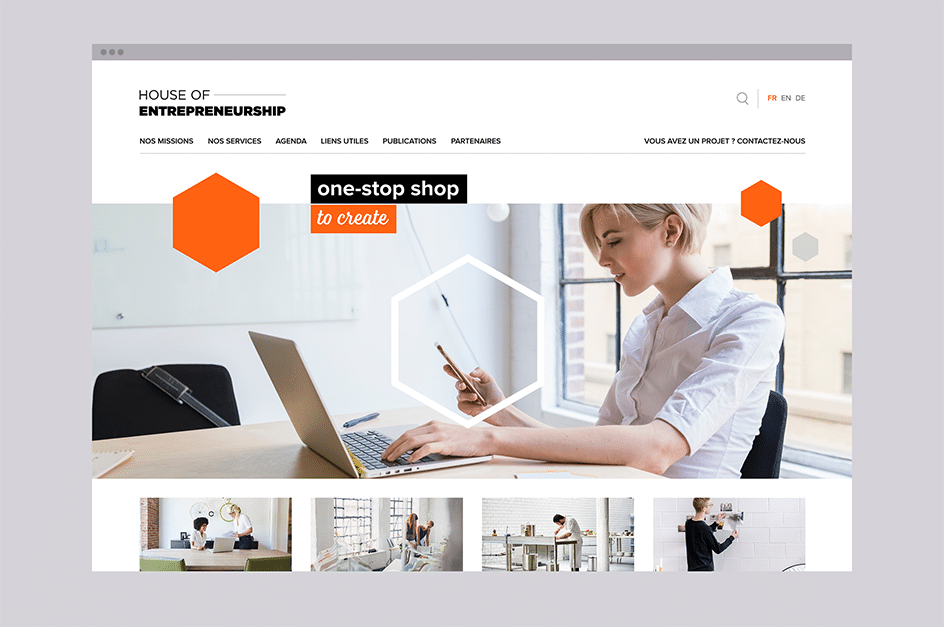
The existing logo of the House of Entrepreneurship was the starting point for creating a rich and complete graphic universe.
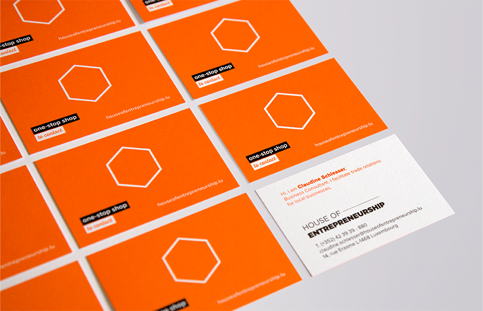
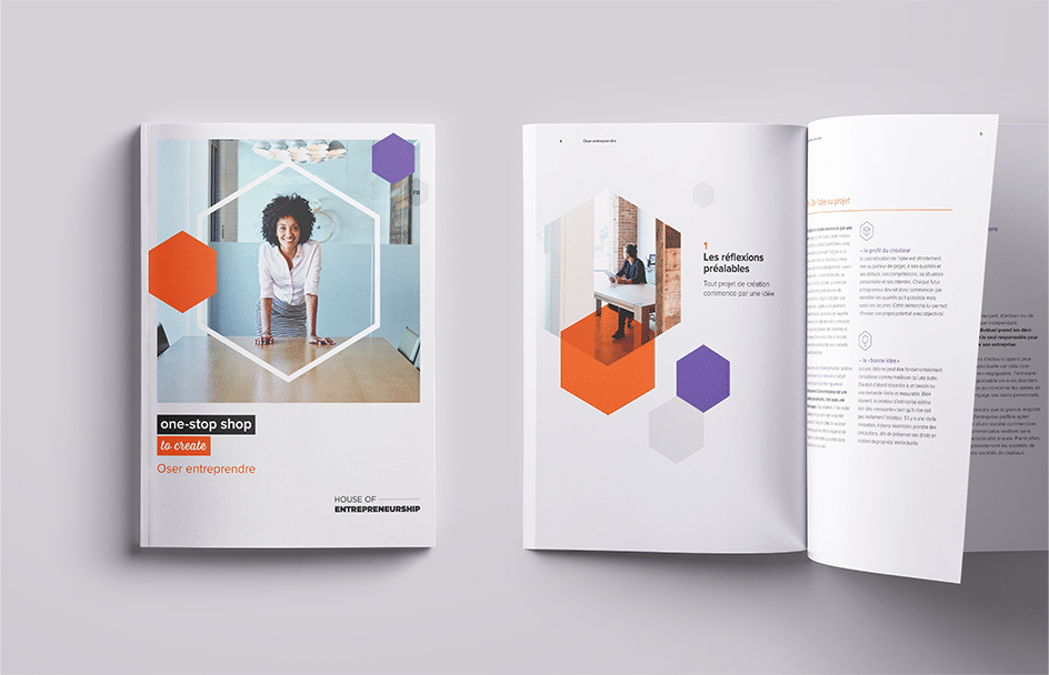
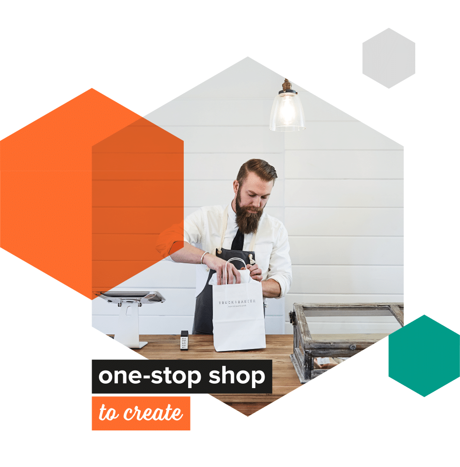
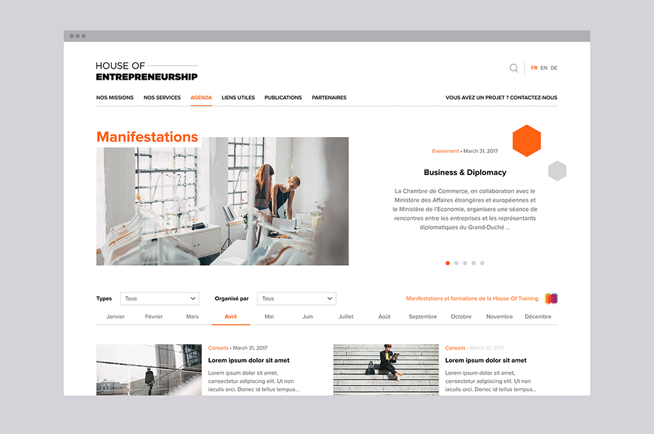
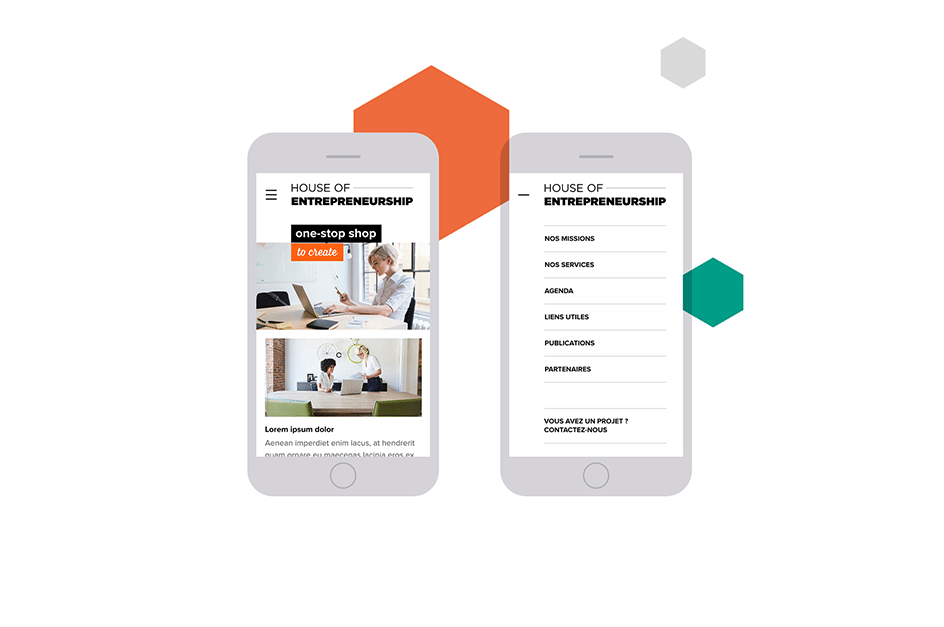
After a slight modification of the logo for greater efficiency, we developed a universe inspired by the décor of the premises the House of Entrepreneurship had moved into shortly before. The idea of the beehive, already present in the presentation of the advisers on site, struck us. The hexagonal shape and the colour orange therefore imposed themselves. Secondary colours were added, as well as an extended photo universe. A layout grid was set up for the brochures, and the website design was created in the same spirit.
In parallel, we also developed a slogan to support print and web campaigns around the concept of One Stop Shop, which also already existed but was poorly exploited. A whole series of verbs was added to this mention in order to cover the full range of the House of Entrepreneurship’s activities. The slogan has now taken its rightful and natural place, and it effectively accompanies the logo.
Today this work has served as the basis for creating neighbouring identities, such as the Entrepreneurs Days.
Browse a few pages of the brochure