Microlux is a new microcredit service dedicated to Luxembourg and the Greater Region, which also offers support and coaching. Microlux helps people excluded from the banking system to borrow in order to launch a professional activity. These loans, ranging from 5,000 to 15,000 euros, are also followed by a company-creation support service through mentors from the business world.
The logo had to reflect very positive values and convey a caring character.
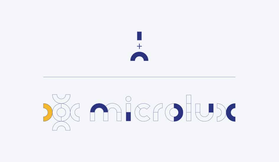
At the origin of this identity are two very simple geometric shapes, which allowed us to create a typeface from which the logo was formed.
We extracted the letter “o”, a symbol of the sun and its radiance, and logically chose the colour yellow to reinforce this solar reference.
The result is a unique and strong identity, distinctive and recognizable, with unifying values, which opens the way to future developments.
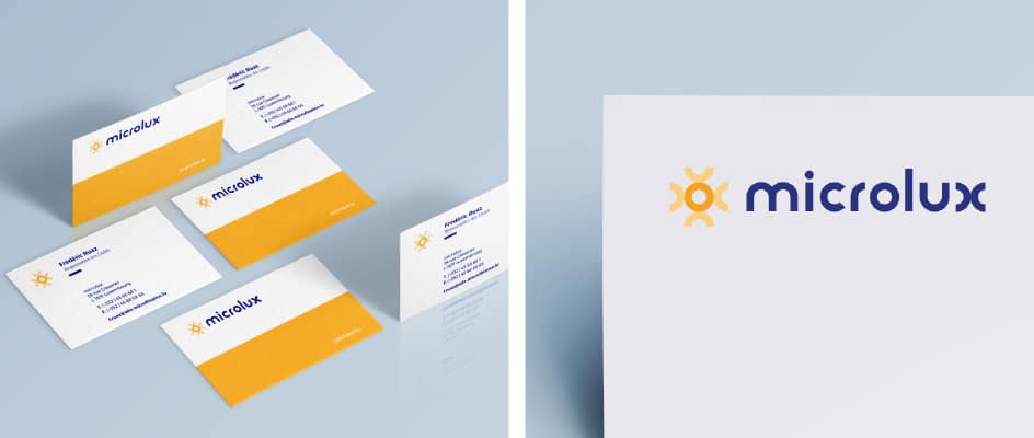
We applied this logo to all the media needed to launch the service: business cards, letterhead, PowerPoint, as well as a holding page, the forerunner of the website we will create later.