myenergy is the reference Luxembourg structure for energy information and advice.
Corporate
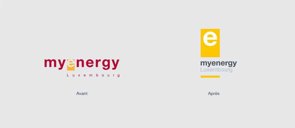
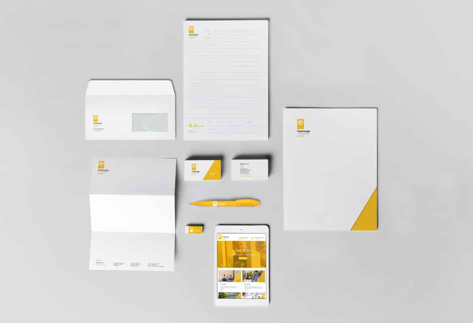
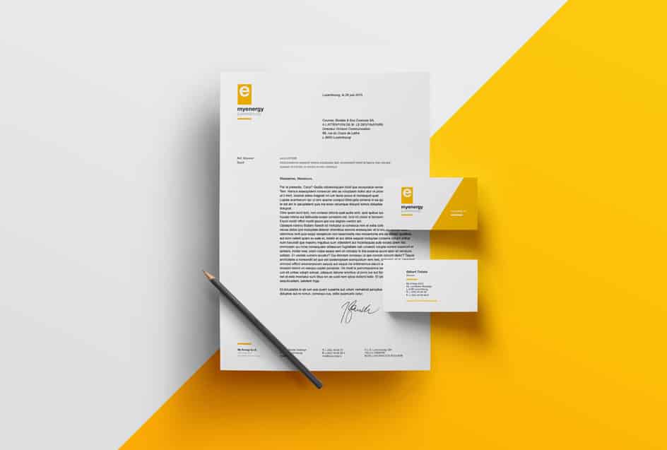
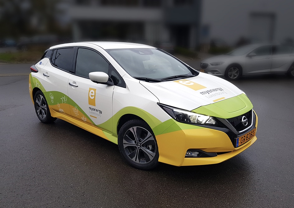
The visual identity of myenergy already existed in everyone’s mind, thanks in particular to its white “e” set within a yellow block.
Over the years, this “e” was reused to create the logos of the various services: yellow without a frame sitting on a blue block for infopoint, white in a horizontal yellow block for the myenergydays, green in a white block for myenergy certified, and so on.
However, the colour codes changed from one service to another, which caused some confusion.
Following our analysis, we therefore proposed not a complete change of identity but a redesign aimed at building on this already familiar “e”. Two watchwords: harmonize and simplify, in order to create a stronger visual identity.
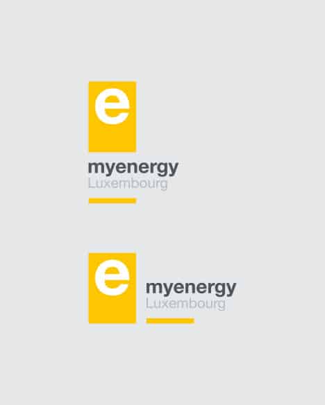
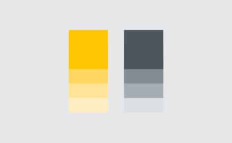
The “e” was lifted away from the edges of the yellow frame in which it was suffocating, the yellow became brighter and more dynamic, the logo was reworked vertically for most media, and the red, which caused confusion, was removed.
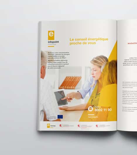
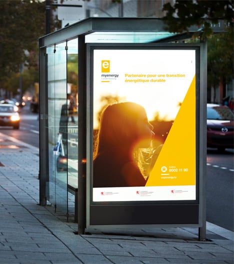
As the master logo became clearer, it was then applied to all the services. The name of the service (always in lower case and attached) now takes first position in place of the mention “myenergy“, with myenergy appearing below in place of “Luxembourg”. Lastly, the colours specific to each entity disappeared in favour of yellow.
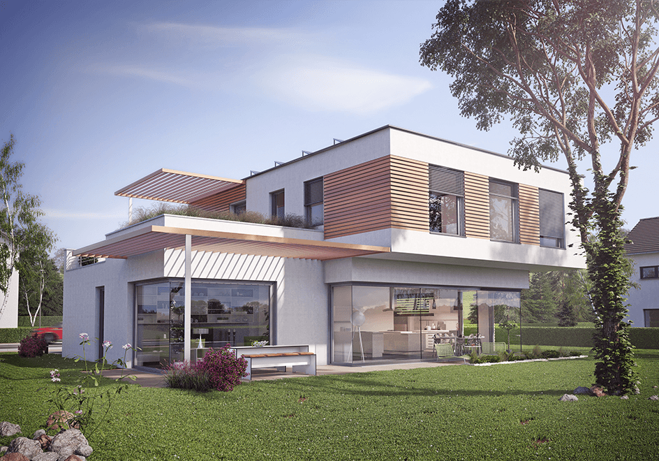
The second stage in creating the universe of myenergy: photographs. The visuals used by the organization were dated and overly demonstrative. We therefore defined a new strategy: a selection of bright, lively photos conveying positive values and creating a genuine emotional bond with the audience.