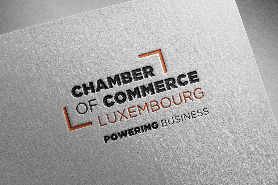
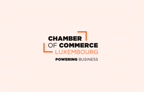
The Chamber of Commerce of Luxembourg has a new logo, designed by our communication agency, h2a. Anne Jung, Communication & Marketing Coordinator, and Patrick Ernzer, Director, Head of Marketing & Communication within this institution, tell us more about this project and about what drew them to h2a’s approach.
What led the Chamber of Commerce of Luxembourg to want to change its logo?
Anne Jung (A.J.): Since 2014, the Chamber of Commerce’s range of services has expanded considerably, with the creation of the House of Training, then the House of Entrepreneurship in 2016 and, finally, the House of Startups in 2018. The logos created for each of these structures were coherent with one another. But the Chamber of Commerce’s logo, for its part, had not evolved and did not really connect with them. It was becoming a little old-fashioned and was losing visibility compared with these new brands. We therefore decided to give it a makeover.
Patrick Ernzer (P.E.): It should be added that the creation of these different structures made the “parent company” less visible. The logo makeover was therefore part of an overall branding strategy, which included other elements: reducing the number of brands overseen by the Chamber of Commerce, and strengthening the identity of the “Houses” as well as that of the Chamber of Commerce as the umbrella structure.
Why did you choose h2a to support you in this project?
A.J.: We have a principle of limiting our calls for tender to three or four agencies, so that each of them has a real chance of winning the pitch. We had appreciated the work h2a had already done for us in the past. As h2a had already worked on the visual identities of the House of Startups and the House of Entrepreneurship, it seemed obvious to include them in this call for tender.

We had very precise ideas about the direction we wanted to take.
Patrick Ernzer
Did you prepare a very detailed brief or, on the contrary, did you prefer to give the agencies carte blanche?
P.E.: We opted rather for the first option. As a rule, we always invite agencies to surprise us and we do not like to impose too restrictive a framework. For the redesign of our logo, however, we had very precise ideas about the direction we wanted to take. We wanted to visually align the Chamber of Commerce logo with the existing logos of the three “Houses“. The brief was therefore more precise and included, for example, requirements regarding the use of typefaces.
Did you hesitate a lot when you received the different proposals?
A.J.: We unanimously opted for h2a’s project. It was immediately obvious.
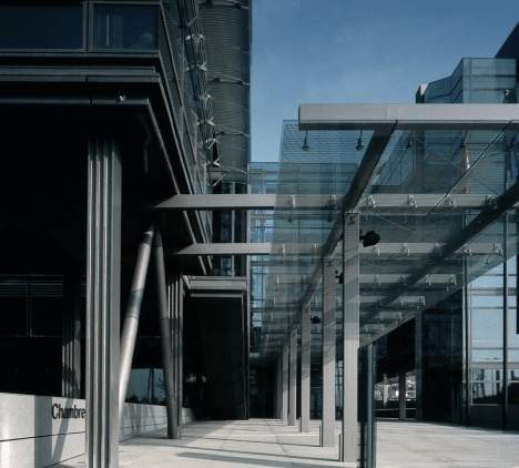
P.E.: As Anne says, the chosen project quickly won unanimous support within the Chamber of Commerce. We greatly appreciated the concept proposed, which takes our building as the starting point, retaining only its cubic form, and then opens up this stylized form to illustrate the idea that the Chamber of Commerce is a “House of Economy”. A house open to the world, to businesses and to ideas, but also a house that frames and offers reassuring stability.
Did you request many changes to the initial project?
A.J.: We had a discussion about the use of English. Initially, the proposal was in French. But, to be more consistent with the name of the “House” entities, we preferred to opt for English, which is moreover the international language of the business world.
P.E.: We also had an internal discussion about the colour of the logo. Our choice ultimately fell on orange, which was already the dominant colour of the existing visual identities of the Chamber of Commerce and the House of Entrepreneurship. It seemed important to us, on the one hand, to ensure continuity with the group’s existing range of products and publications and, on the other, to choose a colour associated with values that are perfectly in line with our development strategy: energy, action, communication, creativity, freshness and dynamic optimism.

We unanimously opted for h2a’s project.
Anne Jung
It was immediately obvious.
What is the added value of h2a for you?
A.J.: As h2a has already won several calls for tender that we have organized, we have been working with them for several years. They therefore have the great advantage of knowing us well and understanding our needs. This allows them to deliver thoughtful, high-quality work that meets our expectations.
P.E.: h2a is an agency that listens to its clients, understands their needs and constraints, and which, at least as far as we are concerned, has always been able to deliver ideas and solutions that have allowed us to move forward quickly and satisfy our various clients and target audiences.
Discover our dedicated page on the Chamber of Commerce of Luxembourg.