On August 13, 2026, Instagram unveiled a new wordmark (the way the name “Instagram” is written at the top of the app). The colorful icon, however, is unchanged.

The previous wordmark, with its very recognizable handwritten lettering, had been in use since 2016. Instagram therefore decided to modernize it after ten years. The goal was cleaner, more contemporary lettering that still keeps references to the brand’s original identity. The new design is in fact lettering drawn by hand specifically for Instagram, not a downloadable font. As in 2016, the new identity is divisive. Some appreciate its more modern feel, while others find the new wordmark less legible: the “r” visually closes in on the “g.”
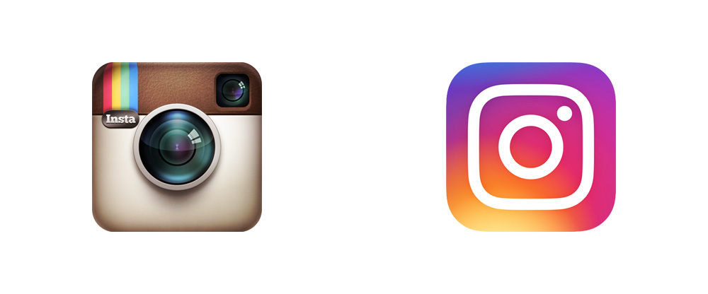
This change recalls the major redesign of 2016. At the time, Instagram replaced its old realistic camera with a much simpler, colorful icon, to reflect the platform’s evolution into much more than a photo-sharing app.
With its new wordmark, Instagram is once again seeking to evolve its image without losing what makes the brand recognizable.