Article updated in July 2026
Colour has its place in marketing strategies. It has the power to attract, to strengthen a brand’s image and values, but also to trigger purchases or to contribute to brand loyalty. This unconscious influence on us has been proven by numerous studies.
But how are colours used in marketing to influence us?
According to a study carried out by Neil Patel Digital – color psychology:
- 93% of consumers believe that the appearance of a product is the most important factor in the act of purchase.
- 84.7% say they buy a product because of its colour.
- For 80% of consumers, colour serves brand awareness, which is itself closely linked to the trust felt in the brand or product.
These statistics are widely quoted on the web, but they have the merit of supporting points without proving them.
The importance of colour perception in marketing
Colour psychology in marketing is the perfect tool for optimizing your brand’s visual identity, capturing customers’ attention and improving the user experience.
The link between colour and emotion is of course complex. It is not always an exact science that applies to everyone. The meanings of colours are the result of many factors:
- Personal experiences
- Context
- Personality
- Cultural differences
- Gender

That is why, before choosing a colour, it is important to ask yourself: who is my target audience?
The perception of colours according to culture:
The same colour can be perceived differently across cultures. What one culture sees as positive may appear negative to another. The meaning of a colour can change completely from one country or part of the world to another. If the target audience is international, it is therefore important to choose “universal” colour combinations.
For example, in the West white is a sign of purity and innocence, whereas in China this colour symbolizes death.
The perception of colours according to gender:
To develop your colour strategy, you can also base it on the gender of your target audience. It may be worthwhile to choose one colour over another depending on whether you are targeting women or men.
Women are generally more interested in soft colours and are receptive to shades. They are often reluctant towards colours such as grey, brown or orange.
Men, on the other hand, generally appreciate brighter colours and are receptive to nuances. They appreciate brown or purple less.
It is therefore essential to take all of these aspects into account to find THE colour combination that best suits your target audience in your marketing strategy.
The power of colour psychology in marketing
There are also broader factors than colour perception. The role that colours play in prospects’ behaviour must also be taken into account.
Many studies show that certain colours trigger a whole range of emotions and behaviours associated with purchasing. According to the study “Impact of Color on Marketing” (academic article, Journal of Marketing Theory & Practice / Emerald), up to 90% of instant judgements about products are based solely on colour.
Colours are just as important when it comes to conversion rates. A call-to-action button (CTA) with a colour that stands out from the rest of the site’s content can, for example, increase the conversion rate by 11% (according to Paul Olyslager, UX Lead).
There is also a link between the use of colours, the perception of personality and, in particular, the relevance of a brand in the eyes of customers. In other words, it is important to opt for a colour that is relevant to the products or services sold, because obviously no colour is universally better than another for a call-to-action button. Find the conversion rates by colour here.
Consumers also love recognizable brands, which makes colour all the more important when creating a brand identity.
This confirms that colours greatly affect purchase intention because of the impact they have on how a brand is perceived.
Accessibility and contrast
While choosing your shades well is crucial for making an impression, you must not forget contrast and accessibility. Unreadable text on a poorly contrasted background is a lost message for part of your audience.
Beyond user experience, it is now a legal requirement: from June 28, 2025, the European Accessibility Act will impose new rules on the private sector. If your company has more than 10 employees and exceeds €2 million in turnover, your digital media will have to meet level AA of the WCAG standard, which imposes strict rules on colour contrast. Learn more about digital accessibility.
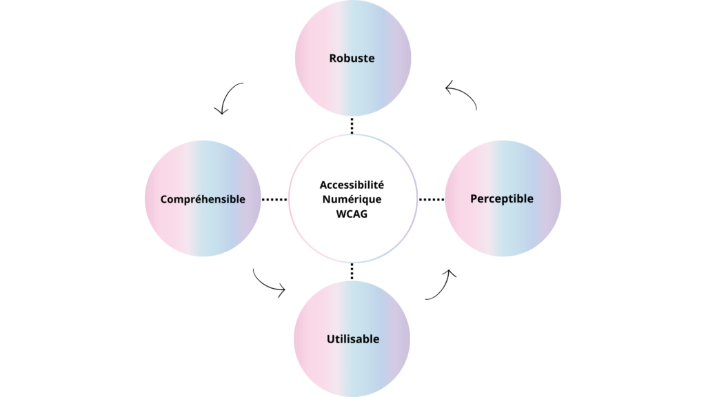
Designing your colour palette so that it is accessible is therefore no longer a simple recommendation: it is a legal obligation, and a clear demonstration of your commitment to inclusion.
From theory to practice: colour at the heart of our work
Valorlux: green as a symbol of commitment and renewal
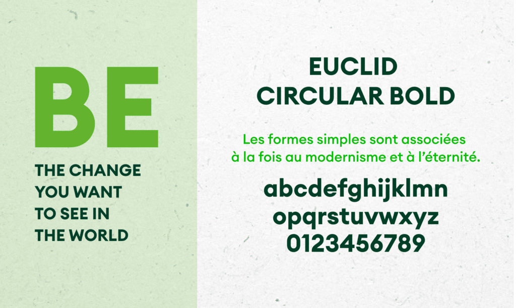
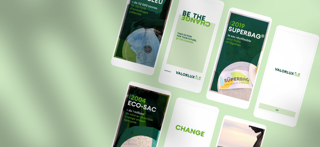
As part of the rebranding of Valorlux for its 25th anniversary and the launch of the “BE THE CHANGE” campaign, our agency rethought the association’s colour palette. To ensure a smooth transition, we refreshed the existing shades while adding a symbolic green dot. This bold colour choice visually anchors the brand in its fundamental mission: commitment to the environment. The new colours thus support a brand image that is at once responsible, close to nature and dynamic.


Chamber of Commerce: orange, a vector of energy and modernity
In order to revitalize the identity of the Chamber of Commerce and reflect the rapid expansion of its initiatives (House of Training, House of Startups…), we chose to build on orange. Already associated with the institution, this highly dynamic colour was kept and rethought to inject a dose of modernity and pure energy. Orange embodies the new baseline “Powering business” perfectly: it is a colour that stimulates, catches the eye and thus symbolizes the Chamber’s continuous support for the entrepreneurial ecosystem.

New identity or complete rebranding?
Our agency supports you in imagining a tailor-made identity and defining the colour palette that truly embodies the essence of your brand. Tell us about your project